Portfolio · 2026

Hello! I'm Coca Diez

I'm a UX/UI designer with 10+ years of experience and a 360° vision that brings together research, design, marketing, and business.

Let's work together
10+
Years of experience
C1
English
AA
WCAG · Accessibility

01 — About me

When empathy becomes interface.

I'm a UX/UI designer with a background in advertising, communication, and UX research. I specialize in visual interface design and HTML/CSS front-end to make the handoff to the development team easier.

My work combines methodology with visual sensitivity to create digital products that work and move people. I'm interested in projects where design plays a clear role in the user experience and in business goals.

02 — Projects

Selected case studies

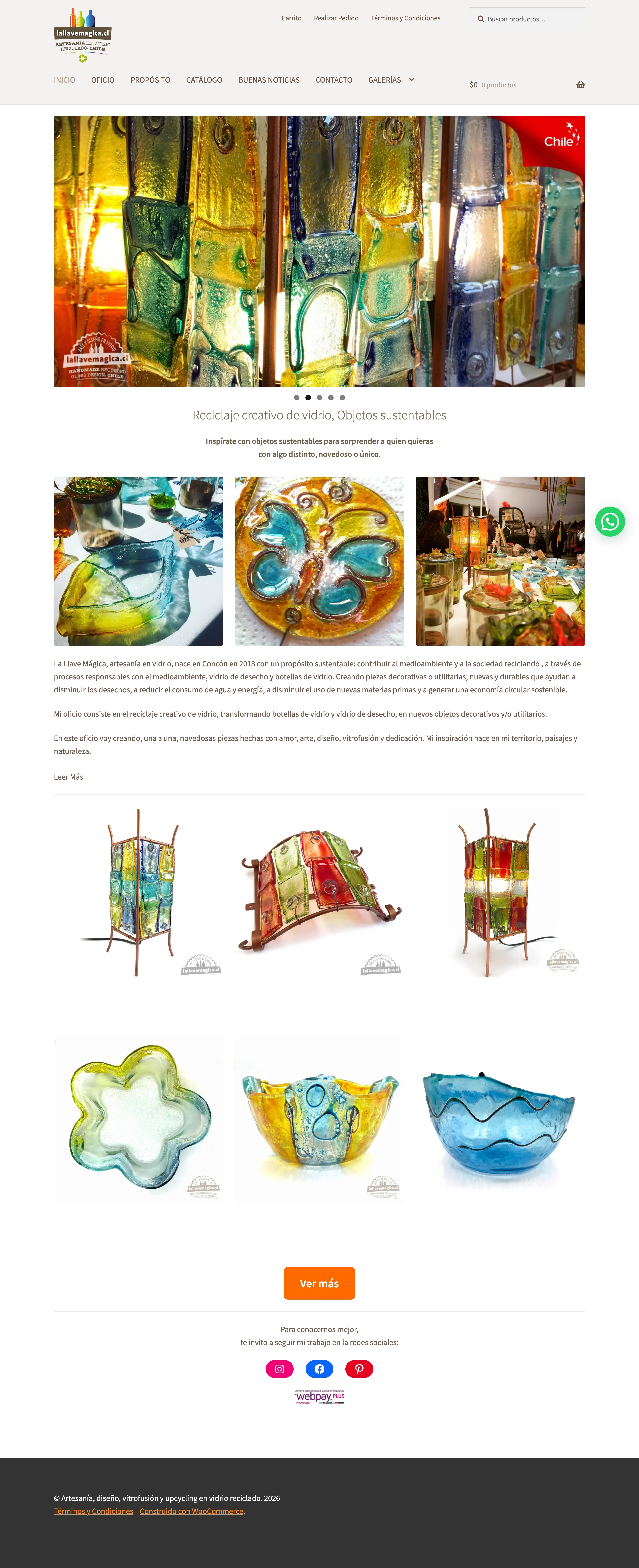
Context and Challenge La Llave Mágica is my own brand of recycled-glass crafts, based in Concón, Chile, whose pieces are unique and handmade. Until 2019, sales depended almost entirely on specialized craft fairs and were highly seasonal.

First the social unrest of October 2019 and then the pandemic, from March 2020, disrupted that in-person channel overnight and, when it reopened, in-person sales venues were no longer curated by niche and became mixed with low-priced imported products, which diluted the positioning of handcrafted goods in general and reduced the channel's profitability. In that scenario, the website existed only as an informational WordPress site, with no transactional capability.

Role and Responsibilities My responsibility was to transform the informational site into a fully operational online store that would replace the in-person channel between 2019 and 2022, while growing organic reach on social media in parallel. I had to design, implement, and run the entire digital and technical ecosystem, content, and decisions in a 100% self-sufficient way, with no external technical support.

Process and Methodology

  • I started from the existing minimum viable product by connecting it with Google Analytics, Search Console, and Semrush to establish a measurement baseline before intervening on the site.
  • I updated the visual layer (UI) of the site and reviewed and improved all existing content before building the transactional layer.
  • I integrated WooCommerce and implemented SEO, defining the catalog architecture and its categories.
  • I produced all the content myself for the catalog: studio product photography, post-production, complete product-page copywriting, and social media content.
  • I integrated Webpay Transbank, Flow, and Servipag as local payment methods and connected the site to Google Merchant Center to enable sales and promotion from a single catalog.
  • I integrated Meta Business Suite to centralize posts, messages, and statistics for Instagram and Facebook.
  • I connected the website catalog with the creation of an Instagram Shop capturing direct traffic to the website, product page, or corresponding landing page.
  • I posted regularly with posts, reels, and stories to announce when I would be at an in-person sales event, present new designs, promote the store's products, and interact with the audience.
  • I analyzed reach, saves, and shares in Meta Business Suite, and upon detecting that narrative reels had greater reach than posts and stories, I prioritized that format in the publishing calendar.
  • I decided to reduce my presence on marketplaces after detecting that commissions inflated the final price and eroded the margin. I also explored exporting to the USA and Canada with ProChile studies, concluding that a high-reach advertising campaign could generate demand impossible to meet with handcrafted production of unique pieces, and would be logistically risky for glass items.

Results and Impact

  • Sales exceeded the previous model of fairs and one-off events, and the entire pandemic catalog sold out, selling faster than more stock could be produced.
  • The own channel became the main source of orders, replacing the in-person fair channel and reaching 90% of total sales. Instagram became the brand's main promotion channel, with a 500% increase in followers and an engagement rate of 4.8, which triggered interest and coverage in print media and TV. Marketplaces remained as a showcase that drove quality traffic to the brand's own site.
  • 69% organic visibility in Semrush by November 2019, with six keywords in first position, against 11% for the next competitor. From late 2019 the site led its category on Google Chile, and that visibility sustained the flow of orders during the pandemic without paid media. Today, with the store on pause, it holds: 5 of the 10 keywords I track are in the top 3.
  • Autonomy and self-management
  • Strategic thinking
  • Data-driven decision making
  • SEO
  • Meta Business Suite
  • Google Merchant Center
  • E-commerce
  • Catalog Architecture
  • Google Analytics
  • Channel Strategy CRO
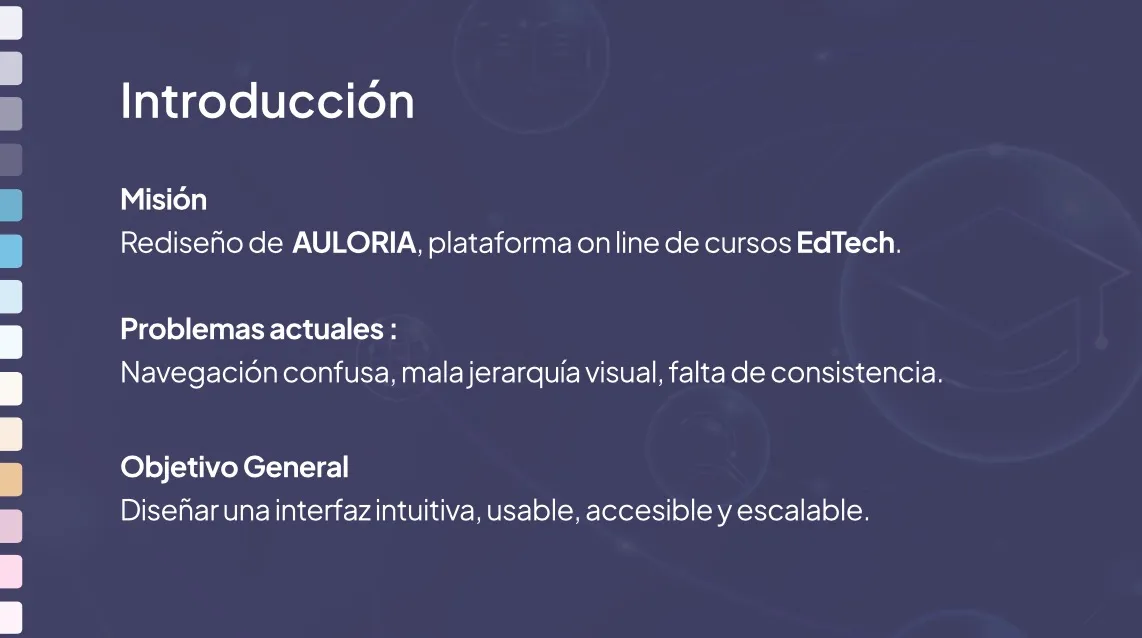
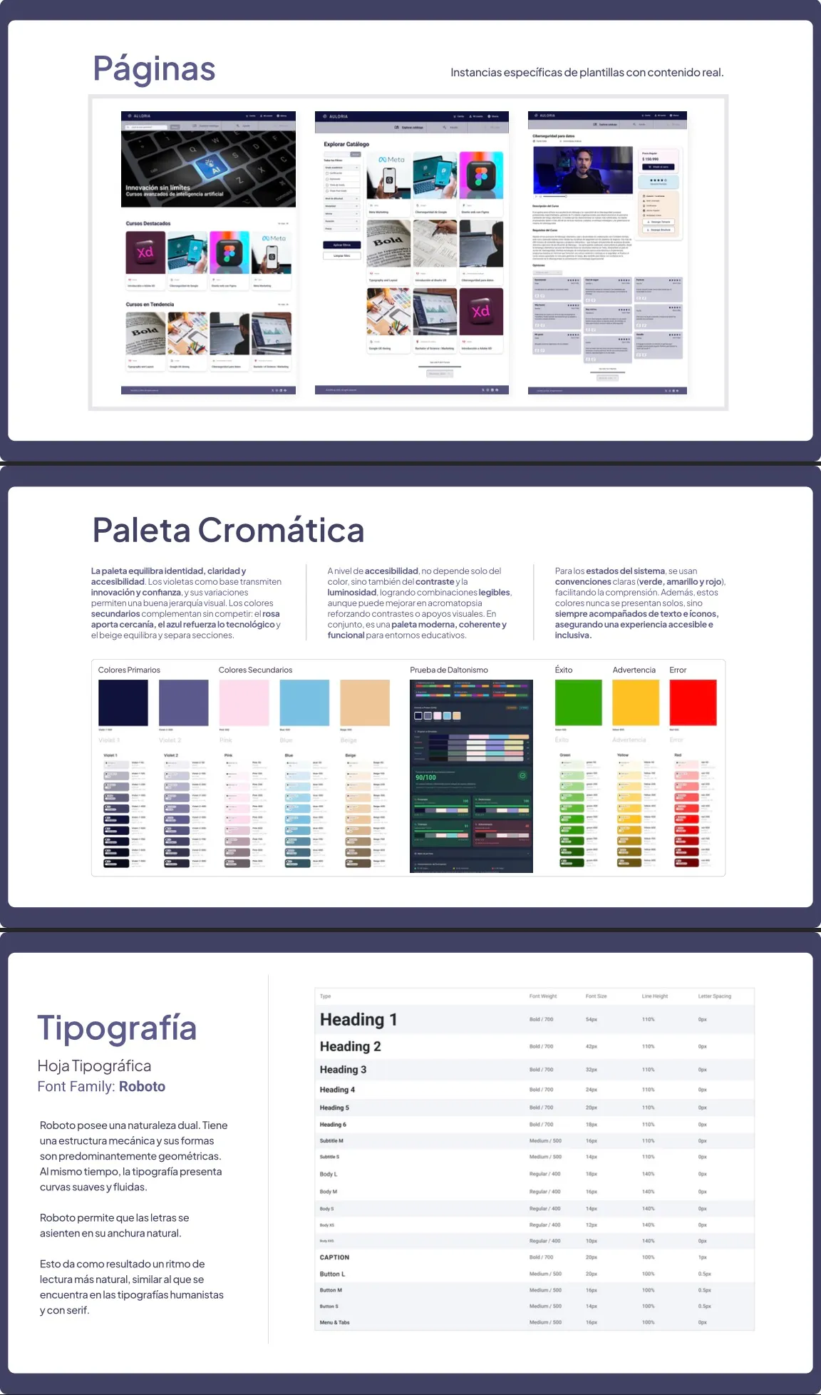
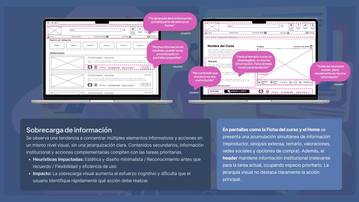
Context and Challenge Auloria had usability problems, confusing navigation, and technical overload that caused high cognitive load and frustrated sign-ups. The challenge was to transform the interface into an intuitive, clear, and adaptable experience across different devices.

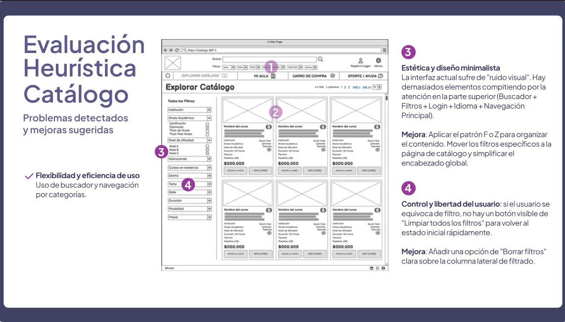
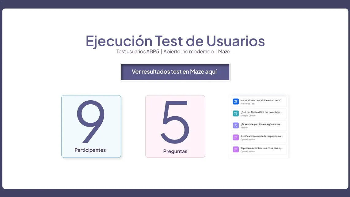
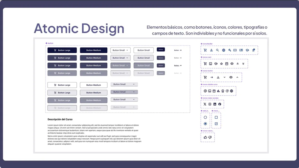
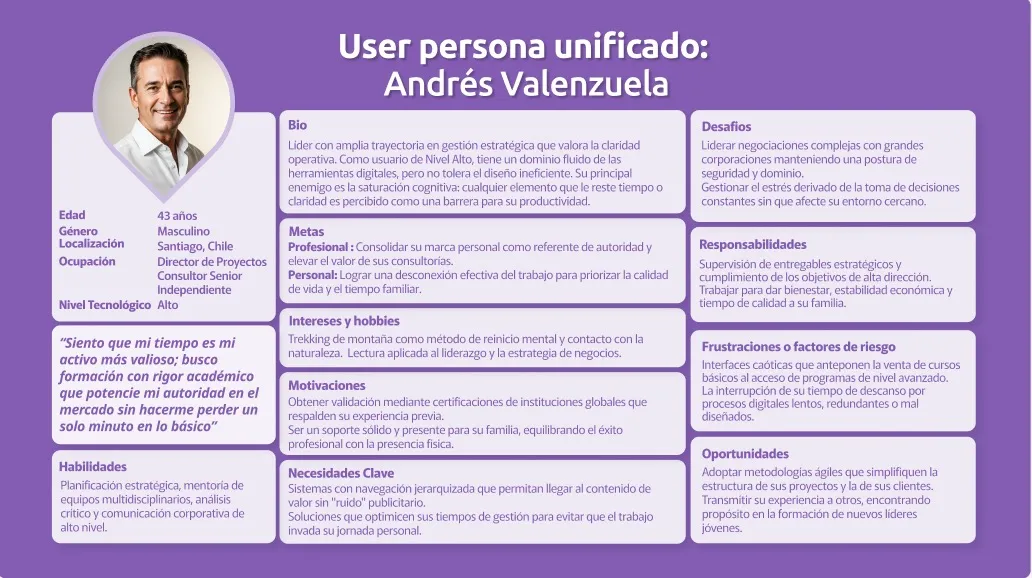
Role and Responsibilities As a UX/UI and Visual Designer, I took part in the heuristic evaluation, the definition of the User Personas and the structuring of the design system under the Atomic Design methodology. I also took part in designing the high-fidelity interface and ran the usability tests in Maze.

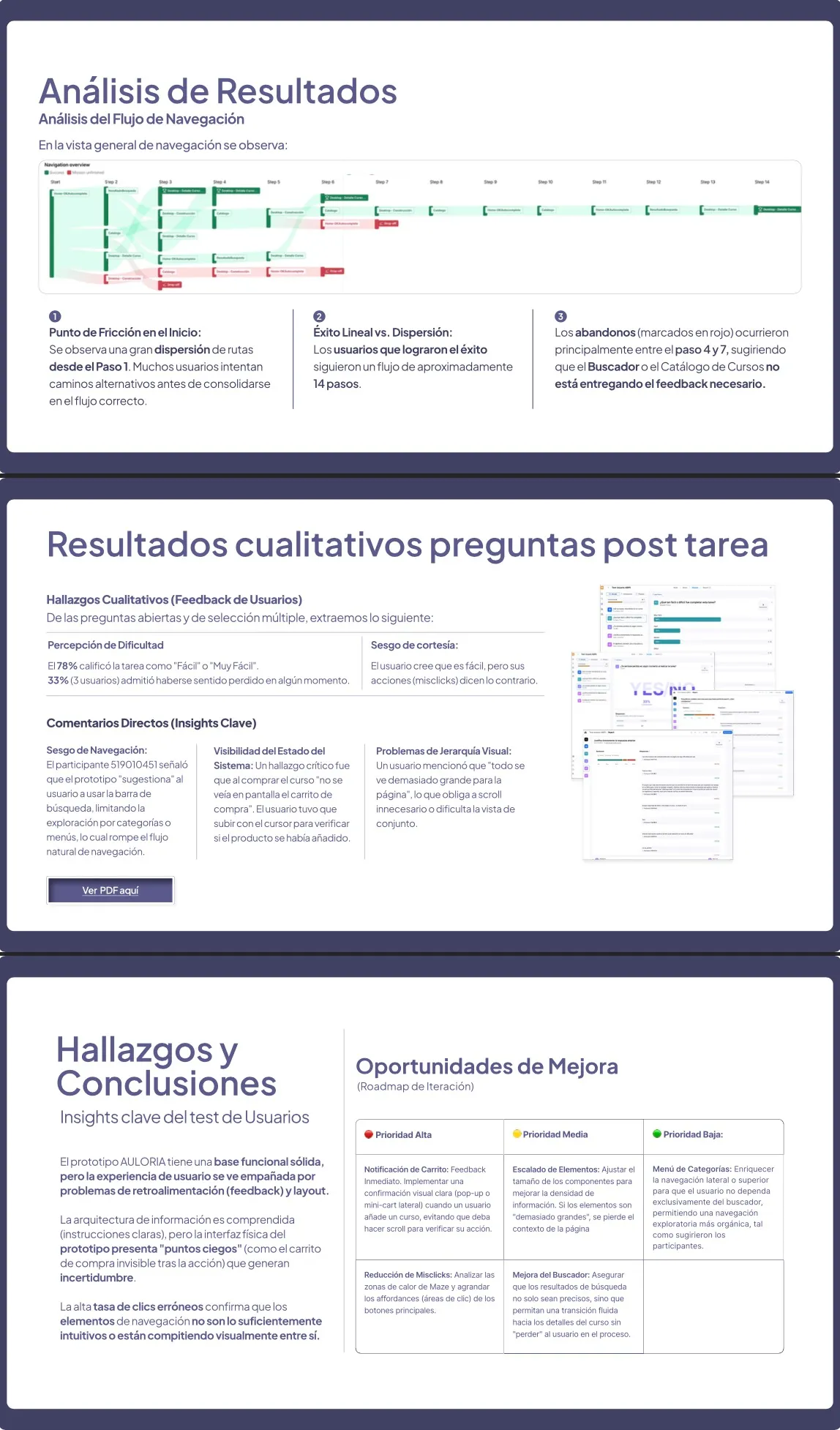
Process and Methodology I began by identifying key flaws such as the lack of feedback in the cart and the disorder in the header. I restructured the screens using F and Z reading patterns, built modular, accessible components, and validated the prototype with users in a quantitative and qualitative test.

Results and Impact Despite an initially positive perception, the metrics revealed 50% erroneous clicks due to courtesy bias. I iterated on the solution by adding immediate confirmations when selecting courses and delivered a responsive system ready to scale.

  • User Research
  • Figma
  • Heuristic Analysis
  • User Personas
  • User Journey Map
  • High Fidelity
  • Guidelines
  • Design System
  • Talento Digital / Alkemy Bootcamp 2026

Context and Challenge The platform had navigation and content organization problems that caused confusion among users:

  • Difficulty finding specific courses
  • Unclear structure and confusing hierarchy
  • Disorientation in key tasks such as search and account management

This created cognitive friction, wasted time, and an inefficient experience. The challenge was to design a clean information architecture so users could select options in just a few clicks.

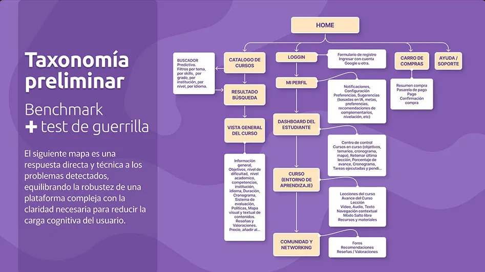
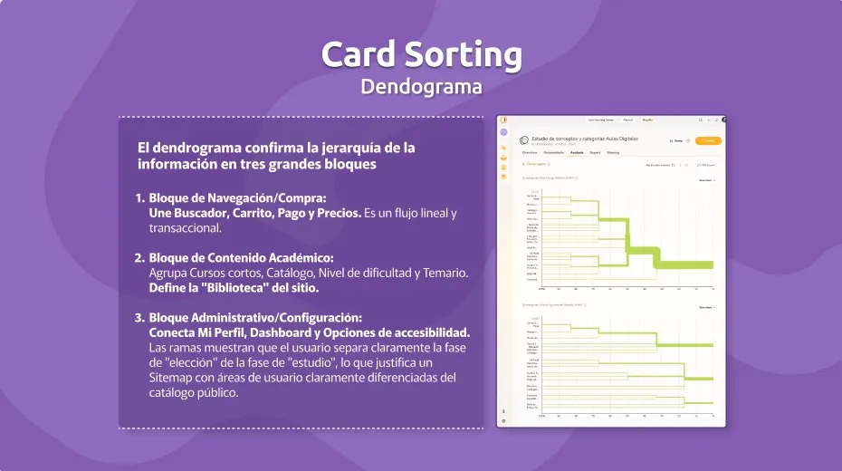
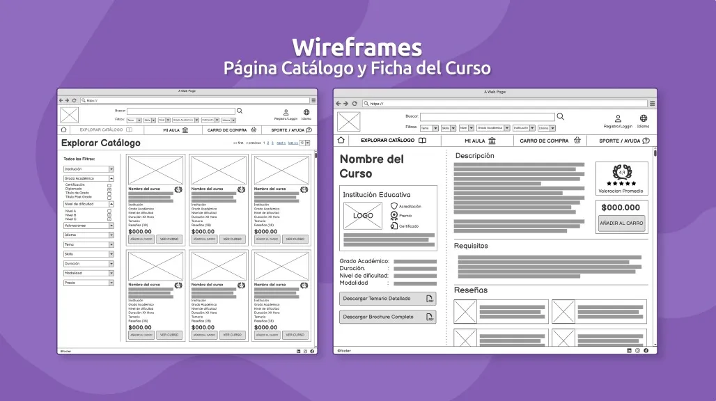
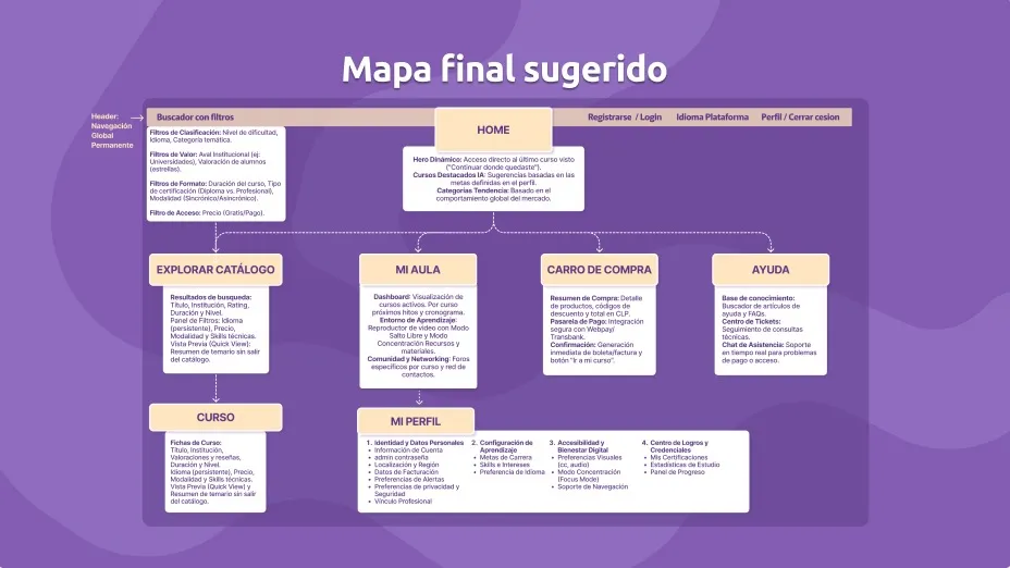
Role and Responsibilities I participated as UX Researcher and Information Architect, handling competitive analysis, initial tests, service mapping, and research into the user's mental model. I designed the navigation map and wireframes and coordinated the Tree Testing.

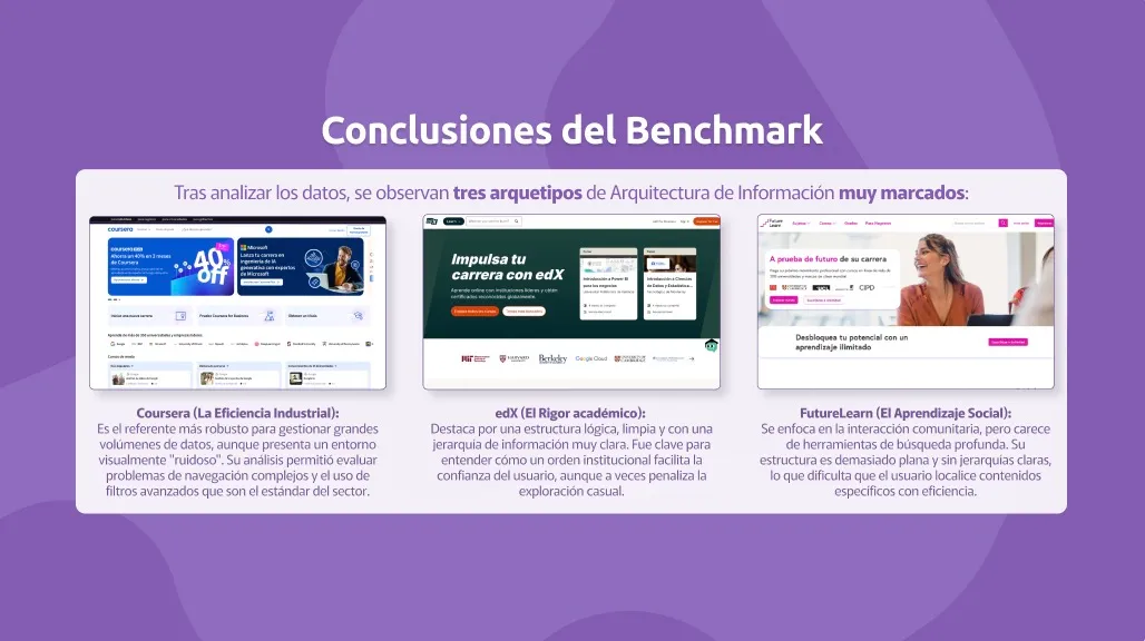
Process and Methodology Competitor analysis and a guerrilla test that recorded delays of up to ninety-eight seconds per task. Considering the profile of a user with limited time, I ran a Card Sorting that divided the site into three clear blocks and structured a proposal validated through Tree Testing.

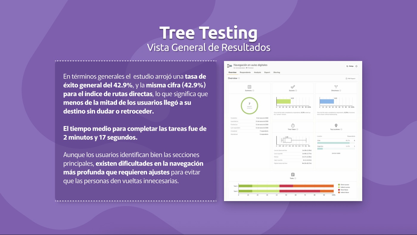
Results and ImpactThe results showed:

  • 42.9% overall success rate in navigation
  • 85.7% first-click success on the main section (Explore)
  • Identification of critical points of confusion in deep navigation, ambiguous labels, and detection of “leaks” to incorrect sections.

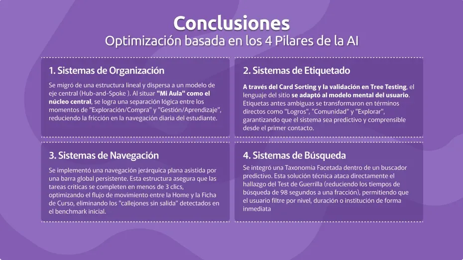
These results showed the need to improve organization, navigation, labeling, and search, which could be applied to a new user flow and a new site map as the final result.

  • Benchmark
  • Service Mapping
  • Card Sorting
  • Tree Testing
  • Site Map
  • Usability Testing
  • Talento Digital / Alkemy Bootcamp 2026

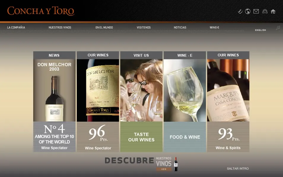
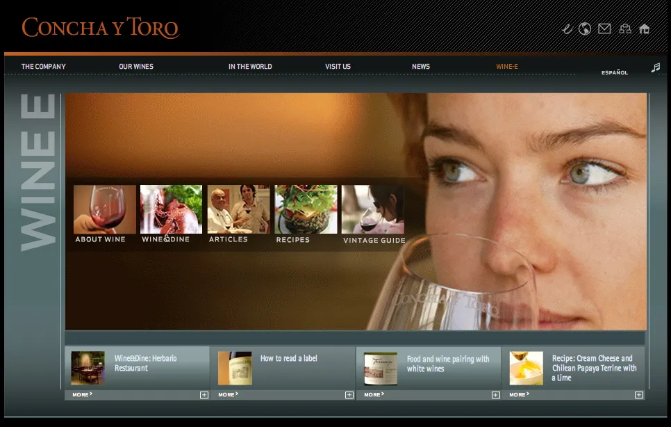
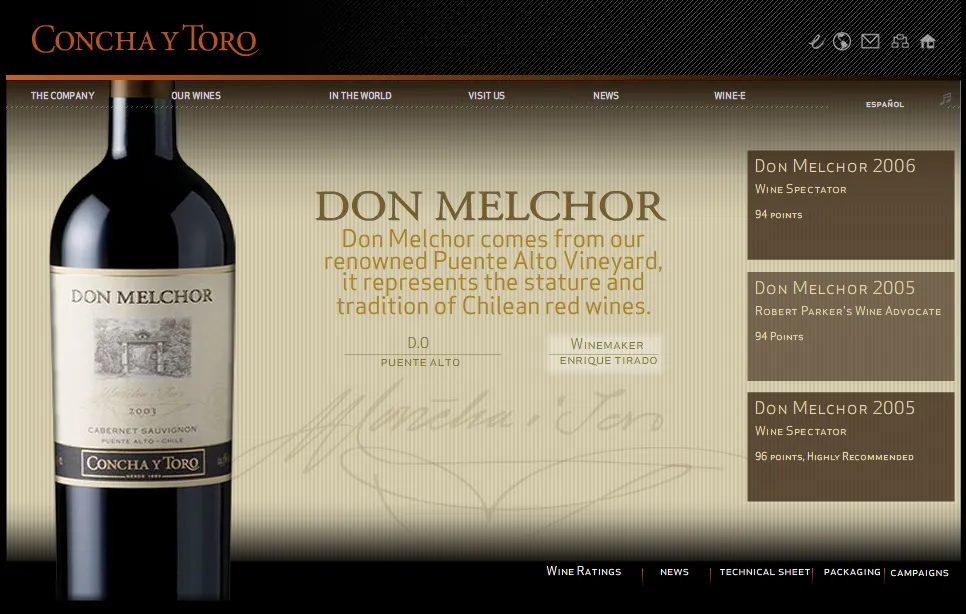
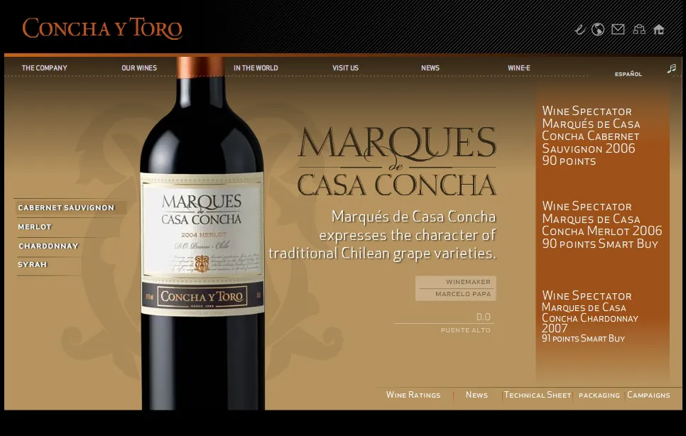
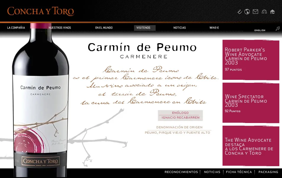
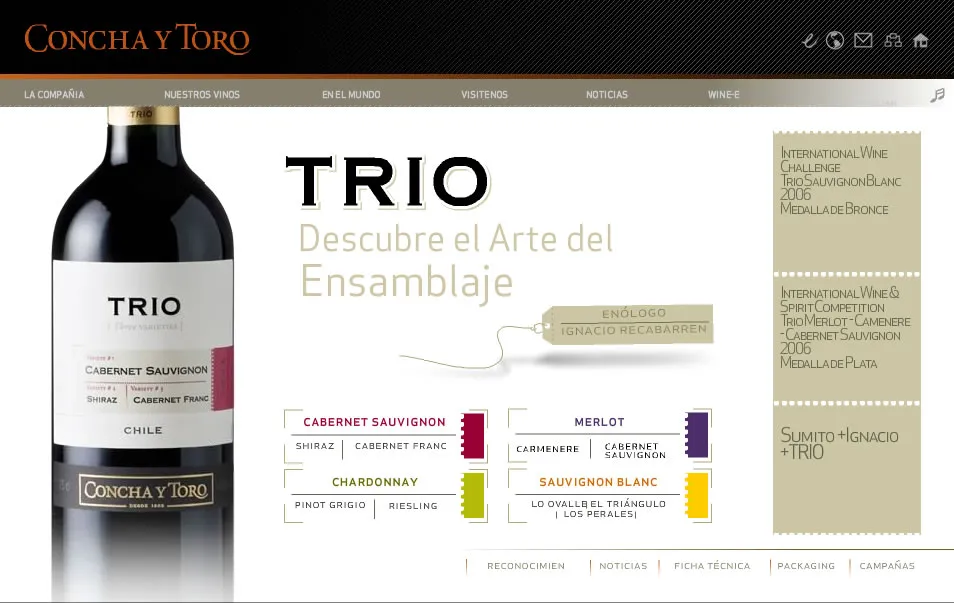
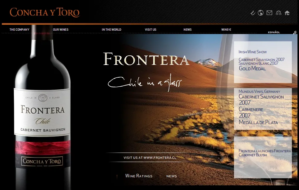
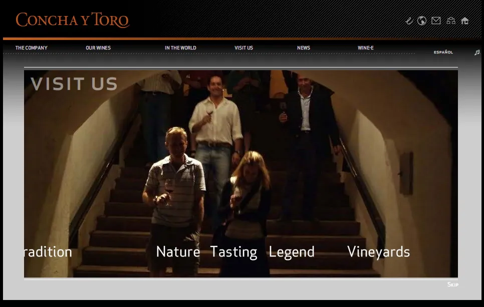
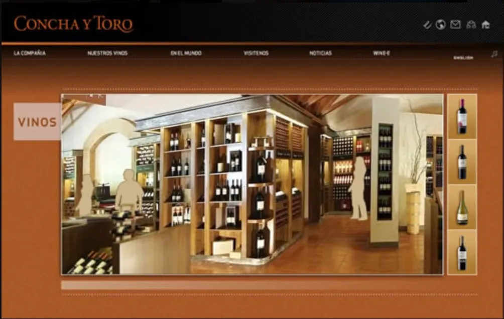
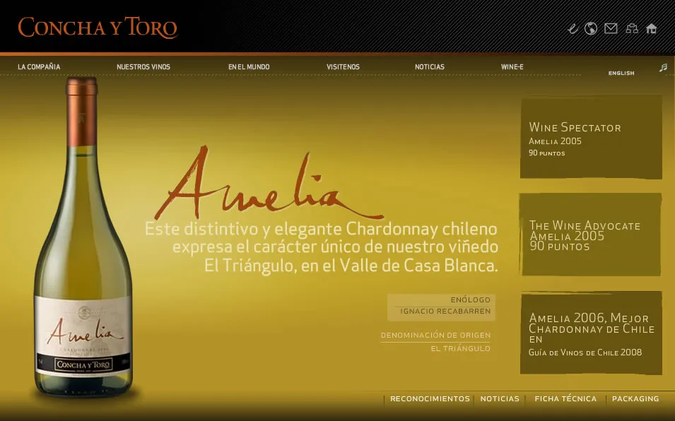
Context and Challenge The engineering firm in charge of building a proprietary CMS for Viña Concha y Toro brought in a web design and development team to support them with the visual proposal and the front-end of the project. The requirements called for a bilingual platform (English and Spanish), an innovative visual proposal with high visual impact that would project the brand's worldwide leadership.

However, after a couple of years of use, the content engine began to show frequent technical failures that created significant friction across many tasks. This led to a second stage in which we were asked to migrate the platform to WordPress to resolve the instability and give independence in publishing content in a project that could scale over the long term.

Role and Responsibilities In both stages I took on the role of UX/UI Designer and was responsible for conceptualizing the look and feel, designing all pages and sections, and coding the HTML and CSS for integration into the proprietary CMS. In the second stage I kept the same duties during the migration, later designing several minisites and maintaining the ecosystem.

Process and Methodology In the first stage, we defined wireframes, built prototypes, created high-fidelity designs, and delivered the HTML files and guidelines needed to develop the proprietary CMS. For the second phase, I cooperated in the transition to WordPress by migrating the existing structure while incorporating the results of continuous usability iterations and improvements.

From that new foundation, I designed a site for the winery's fan club community and later a new minisite expanding the reach to Asian markets with translations into Mandarin Chinese, Korean, and Japanese to support the winery's global partnership with the English professional football team Manchester United.

Results and Impact The migration to WordPress eliminated the critical failures of the previous system and restored operational autonomy to journalists and communications staff to publish material in their respective areas.

The flexibility of the new ecosystem made it possible to support the winery's international expansion and adapt its presence to strategic markets. The project evolved into a recurring service in which I designed, laid out, and sent a monthly mailing, along with continuous maintenance for seven years.

  • Interdisciplinary Team
  • Adaptability
  • Agile Environments
  • Wireframes
  • HTML/CSS
  • Adobe Suite
  • WordPress
  • Design Guidelines

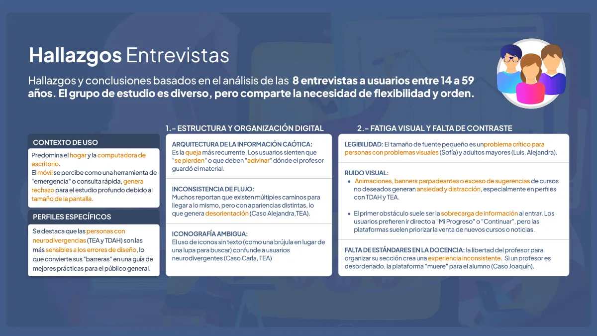
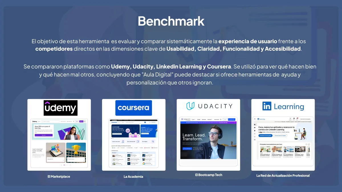
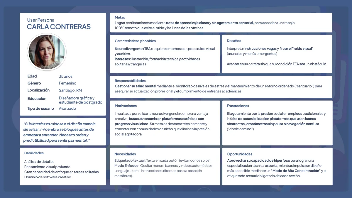
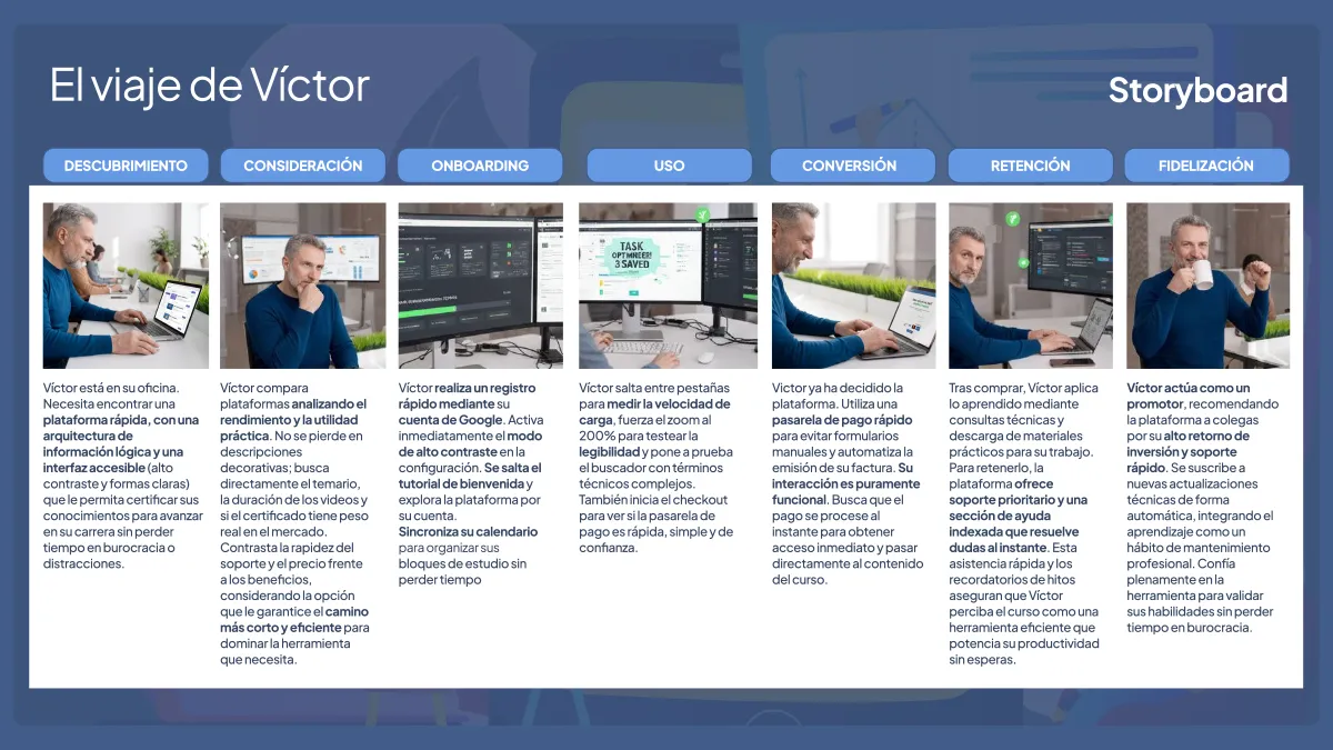
Context and Challenge Digital learning platforms tend to suffer from information overload, lack of contrast, and confusing architectures that make studying difficult. The challenge was to apply qualitative research under a User-Centered Design approach to identify real visual and cognitive accessibility problems, showing that a predictable, clean interface benefits all types of students.

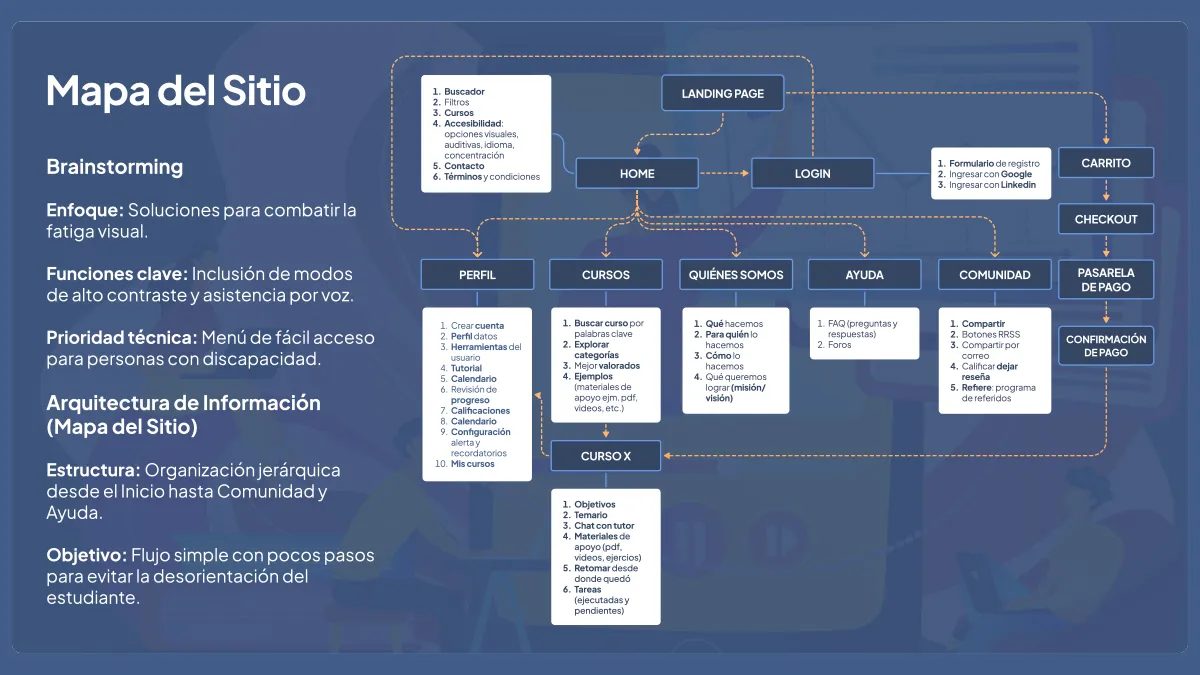
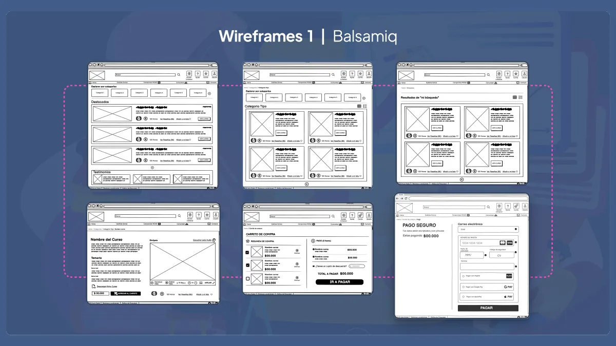
Role and Responsibilities As a UX researcher and interaction designer, I participated directly and actively in conducting the semi-structured interviews, carried out the comparative competitor analysis and took part in creating the site map, Balsamiq wireframes, usability testing, and heuristic evaluation.

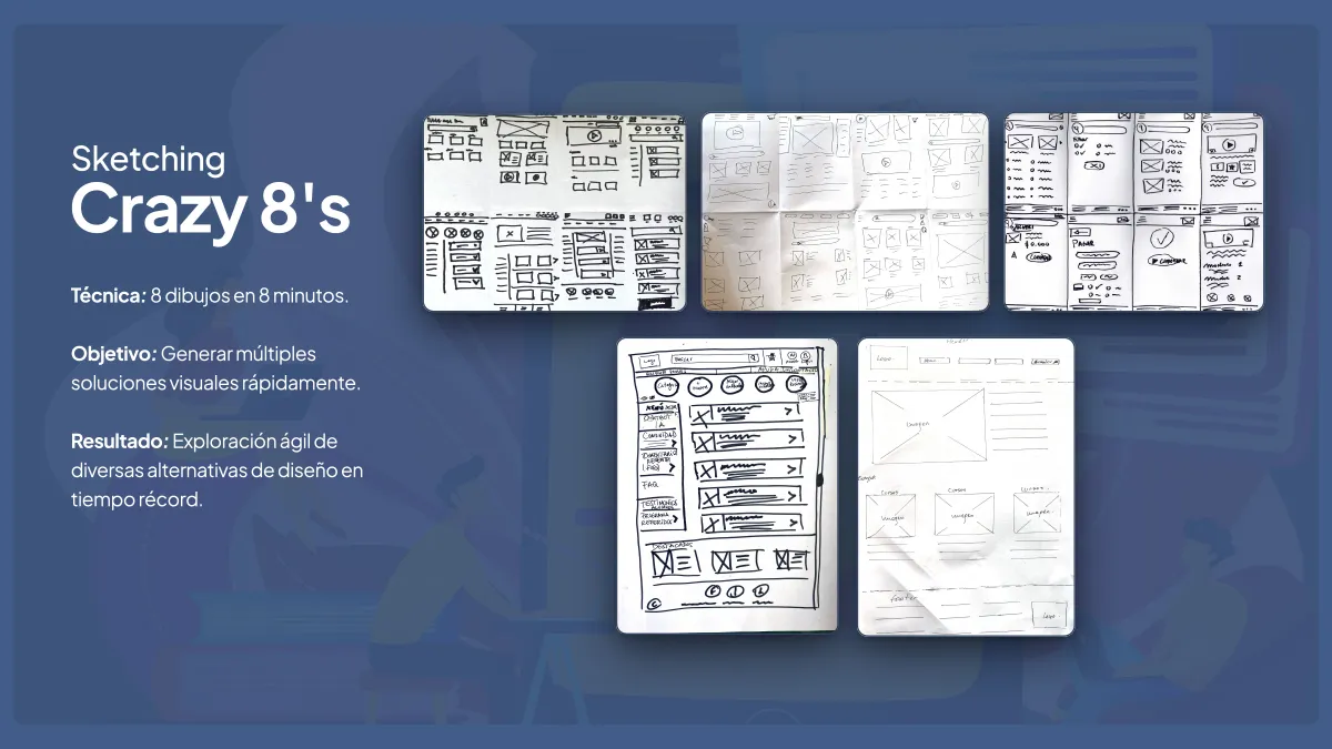
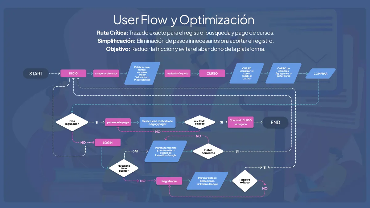
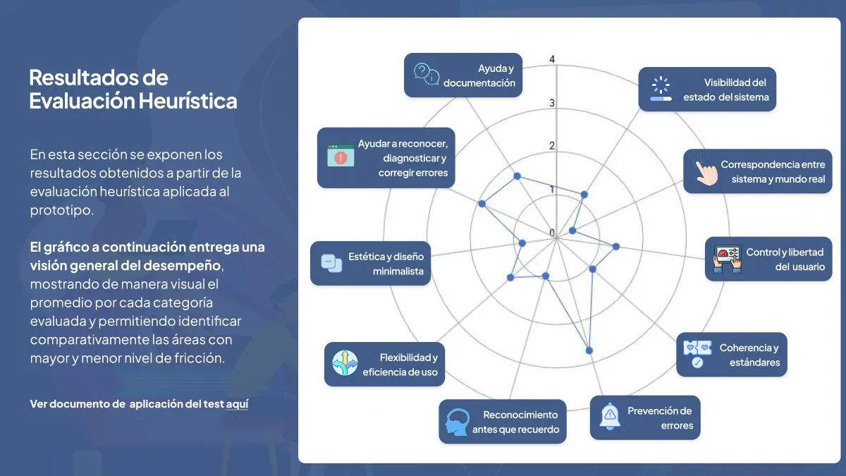
Process and Methodology The research began with interviews to detect usability problems and inconsistencies in current platforms. With the qualitative evidence and the user journey map, we ran rapid sketching sessions, defined the site structure, and implemented a low-fidelity prototype that was evaluated using Nielsen's 10 heuristic principles.

Results and Impact The heuristic evaluation showed an average of 1.4 (cosmetic to minor problems), confirming a functional proposal with no critical usability flaws. The study made it possible to define key actions such as including a high-concentration mode, confirmations in payment flows, and clear text labels to reduce mental load, incorporating personas, journey maps, and WCAG 2.1 AA recommendations.

  • User Interviews
  • Benchmark
  • User-Centered Design
  • User Flows
  • Balsamiq Wireframes
  • Usability Testing
  • Journey Map
  • WCAG 2.1 AA
  • Talento Digital / Alkemy Bootcamp 2026

Context and Challenge As a designer with a profile that combines advertising, visual design, UX/UI, and front-end development, I didn't have a portfolio of my own to showcase my work.

Role and Responsibilities I designed and developed, end to end, a portfolio that works as a digital product and a showcase of work, presenting my profile as one coherent experience. I took on the full role: research, information architecture, visual system design, HTML/CSS layout, technical validation, and publishing.

Process and Methodology I researched about 10 portfolios from similar profiles. The research showed a repeated pattern: visually attractive sites with too much information or effects, which force a long journey to understand the person.

I decided to create a single page with accordion sections to ration the information and lower cognitive load, and defined the architecture in four clear sections: introduction, projects, skills, and contact.

I designed wireframes in Figma to resolve hierarchy and mobile/desktop responsive behavior before moving on to the visual design. Next, I developed the high-fidelity design in Figma and built a dark-mode color system with three levels of surface depth (dark purple background, elevated layers for the hero and sections, and interactive cards), reserving a single accent color for calls to action.

To ensure accessibility, I validated every combination against WCAG 2.1: white text on a dark background reaches ratios of 12.63:1 and 11.94:1 (AAA level), and I identified which combinations (lavender/white, orange/white) did not reach AA for small text, restricting them to large headings and badges.

I defined a type system with Ubuntu Sans for body text and Ubuntu Sans Mono for data and labels, with fluid scaling across mobile, tablet, and desktop.

In the development, I built the page with semantic HTML5 (header, main, section with aria-label, article), added a skip link to the main content and a keyboard-operable accordion pattern with dynamic ARIA attributes (aria-expanded, aria-controls, aria-live).

For the styles, I used CSS and centralized variables in :root for design system scalability, and combined Grid and Flexbox mobile-first with breakpoints at 640/768/1024px.

I used clamp() for fluid typography and grid-template-rows to animate the accordion without JavaScript, respecting prefers-reduced-motion.

I validated the final HTML with the Nu HTML Checker from W3C before publishing.

Finally, I linked the site to Google Analytics and Google Search Console to measure the page's behavior and collect data to iterate on future improvements.

Results and Impact

  • Publication of a single-page portfolio, which recounts some of my cases where I have applied my knowledge of UX research, marketing, UX/UI design, and front-end.
  • No technical errors or warnings in the W3C Nu HTML validator on the production site — verifiable technical evidence, not self-assessed.
  • Main text contrast at AAA level (12.63:1 and 11.94:1), above the AA minimum.
  • Accordion system 100% keyboard accessible, with no dependence on JavaScript for the animation, which reduces weight and points of failure.
  • Feedback from professional contacts turned into a prioritized backlog.
  • A product with verifiable metrics that allow data-driven decisions.
  • Figma
  • Information Architecture
  • Design System
  • HTML/CSS
  • WCAG Accessibility
  • Typography and Fluid Scale
  • Validation and QA
  • Reference Research

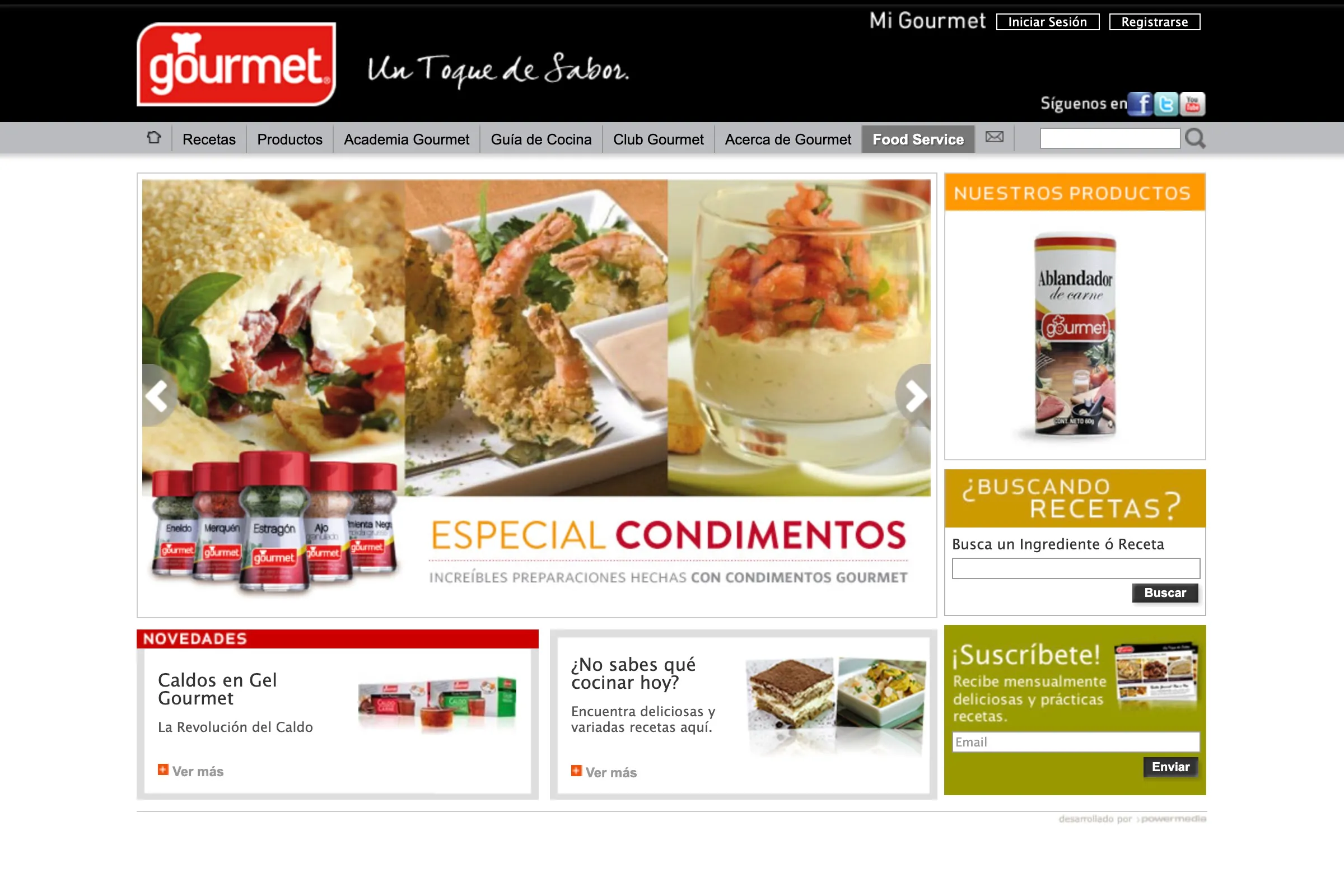
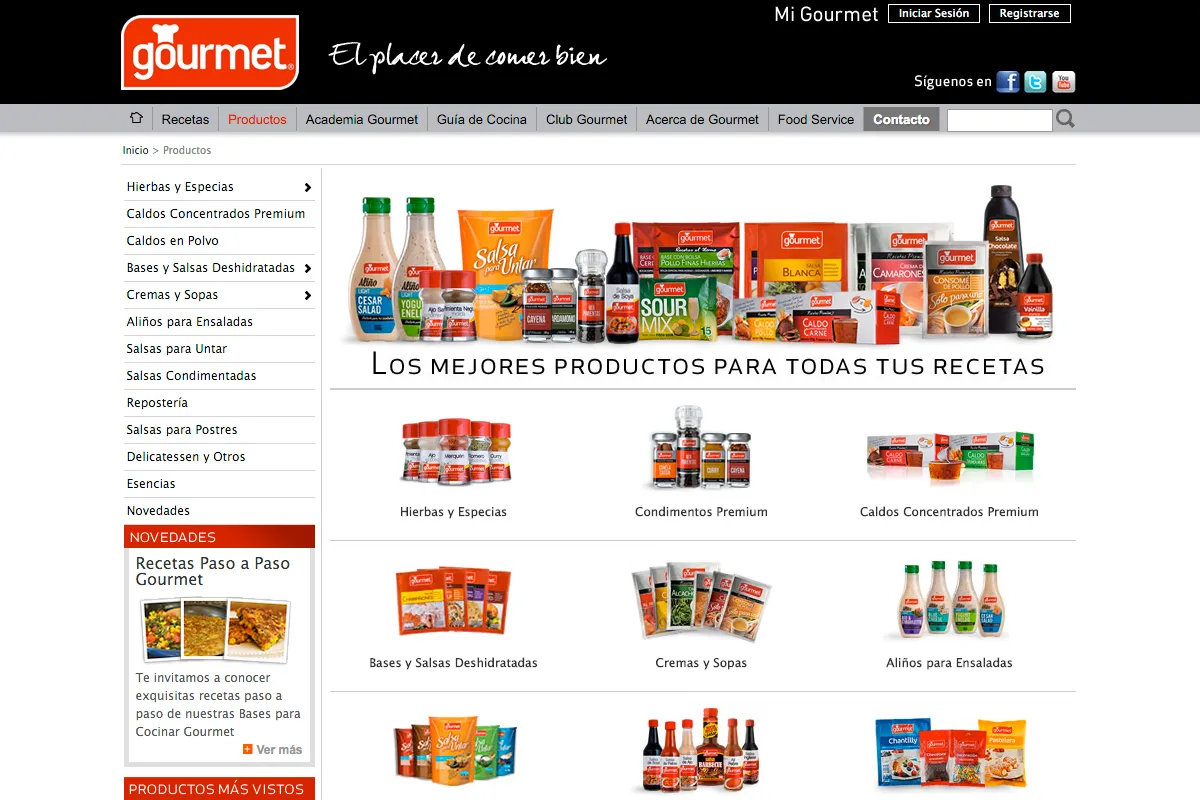
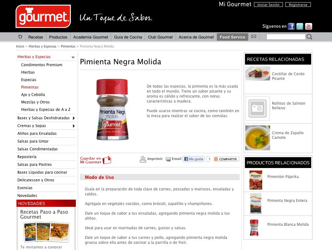
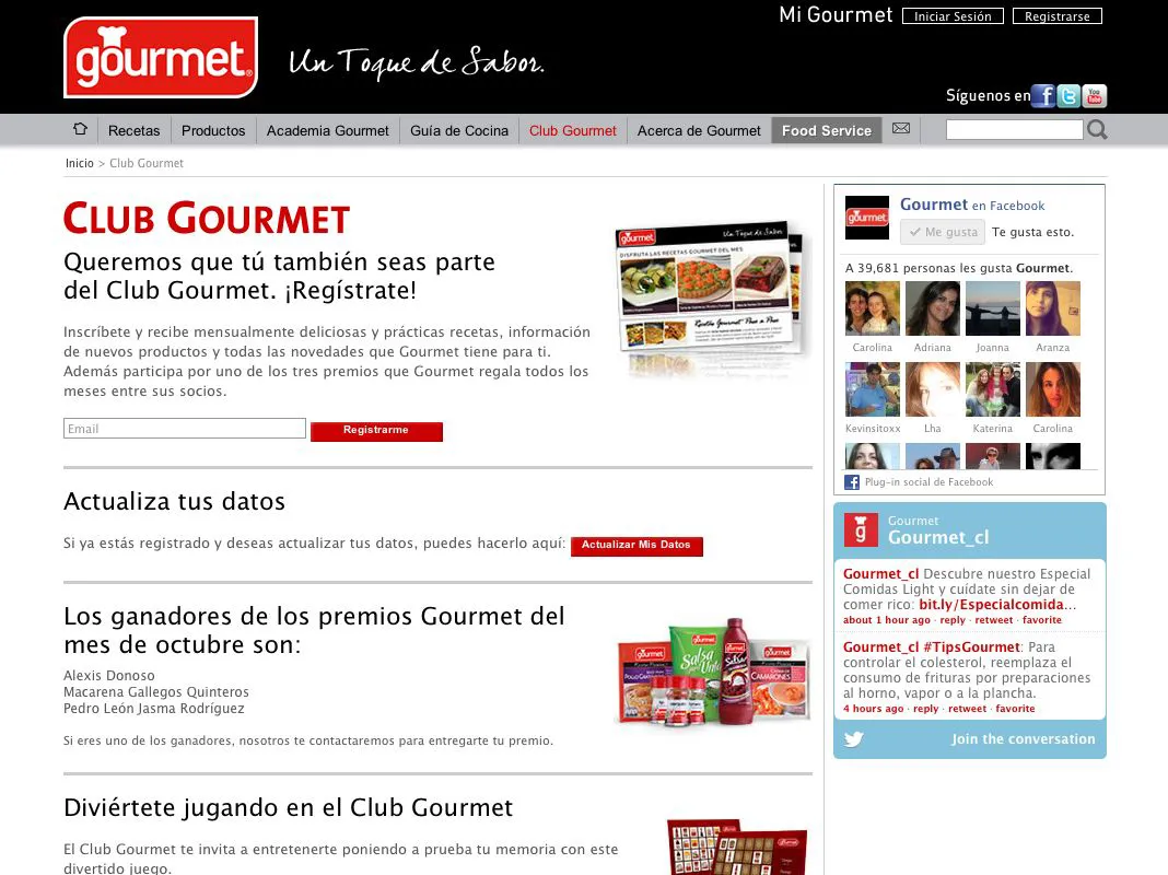
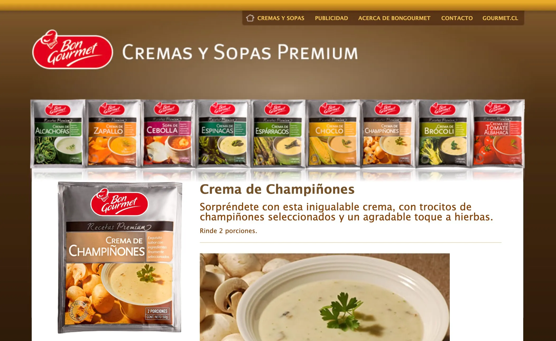
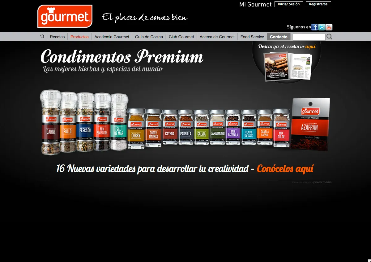
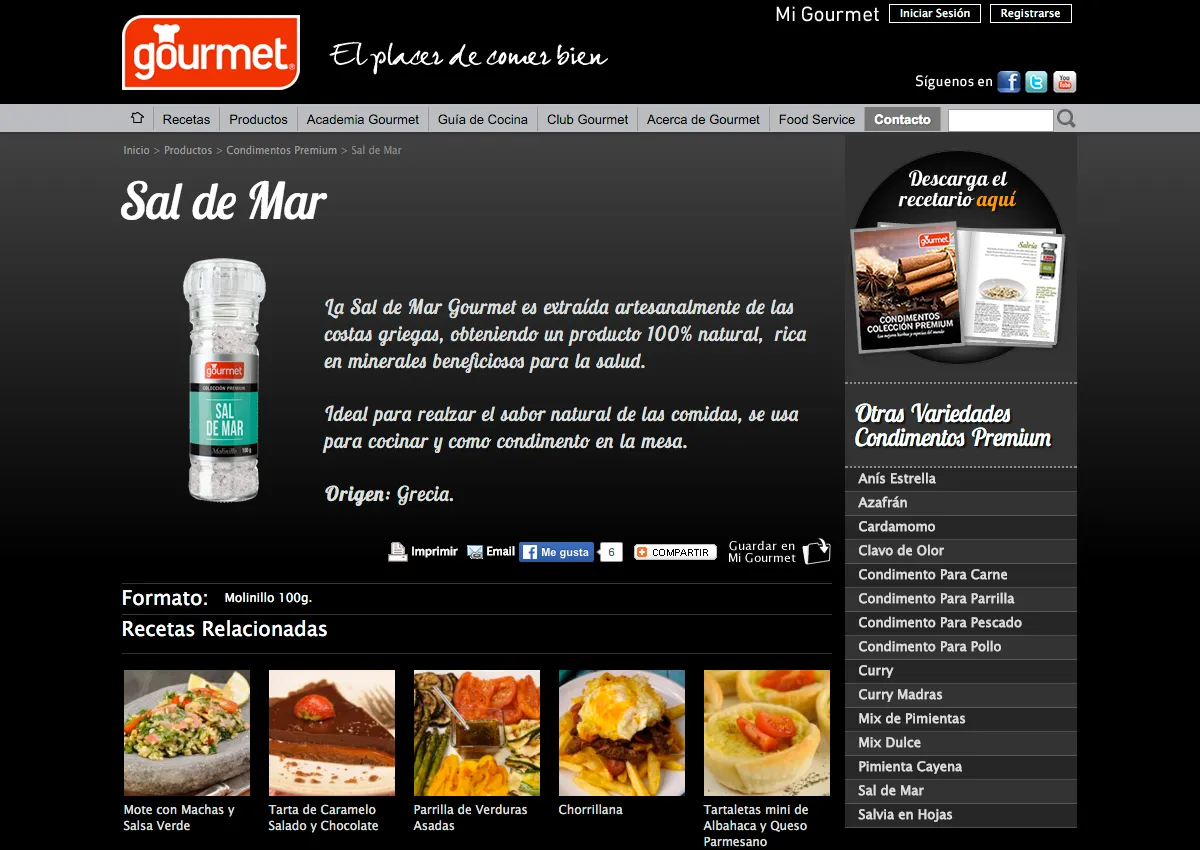
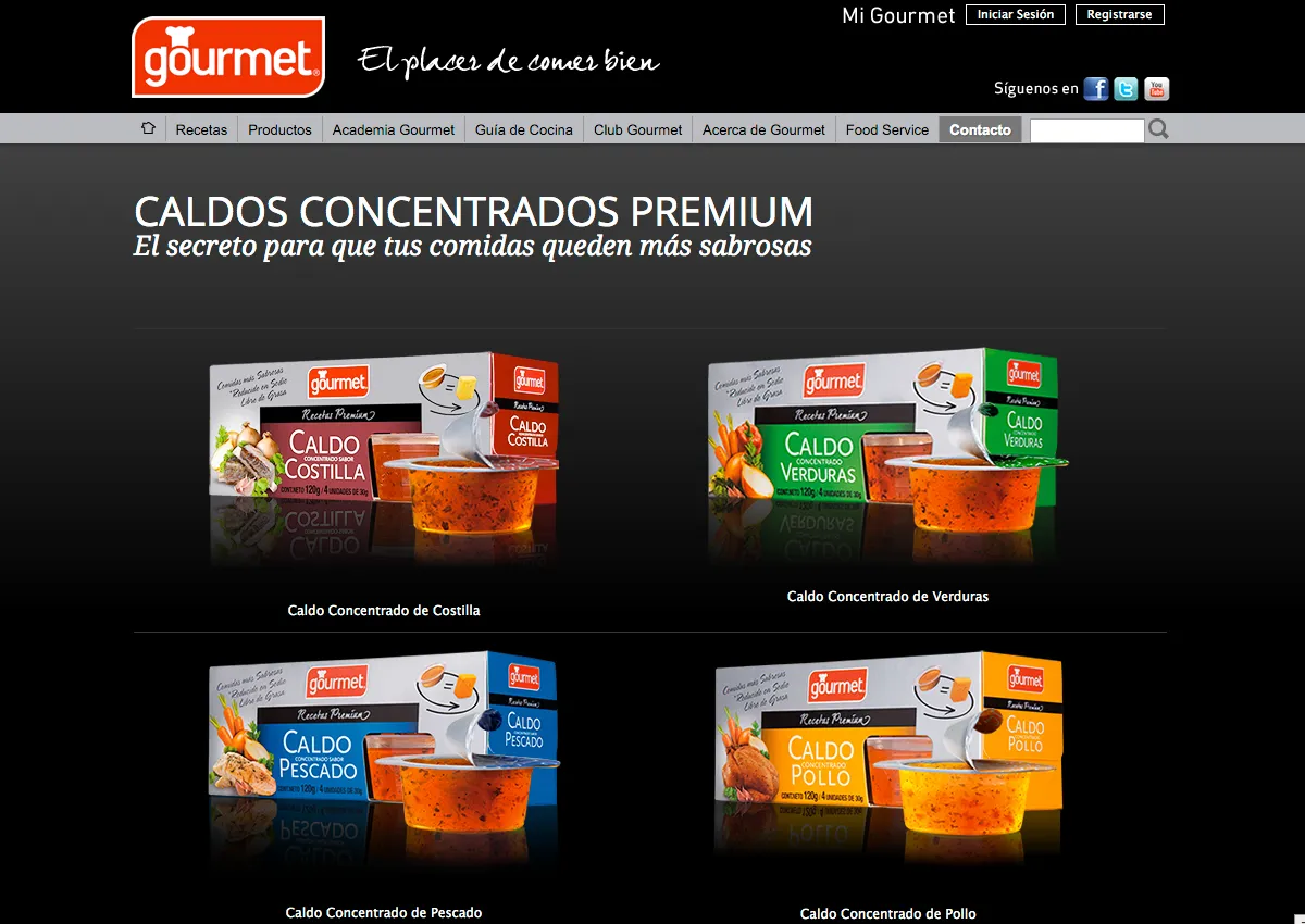
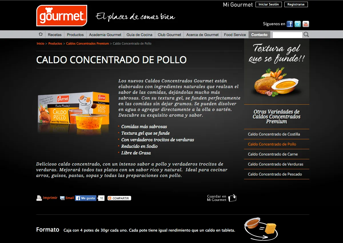
Context and Challenge Good Food S.A., with its food brand Gourmet, began its digital presence in 2000 with a website. The challenge was to support its growth and technological evolution over 15 years, adapting to new trends and business needs.

Role and Responsibilities As a UX/UI designer, I was responsible for the high-fidelity designof several versions of the site, HTML/CSS development, SEO implementation, mailing design and sending, user research, and guerrilla-style usability testing to validate and improve the experience. Ongoing iteration with the client and constant improvement proposals.
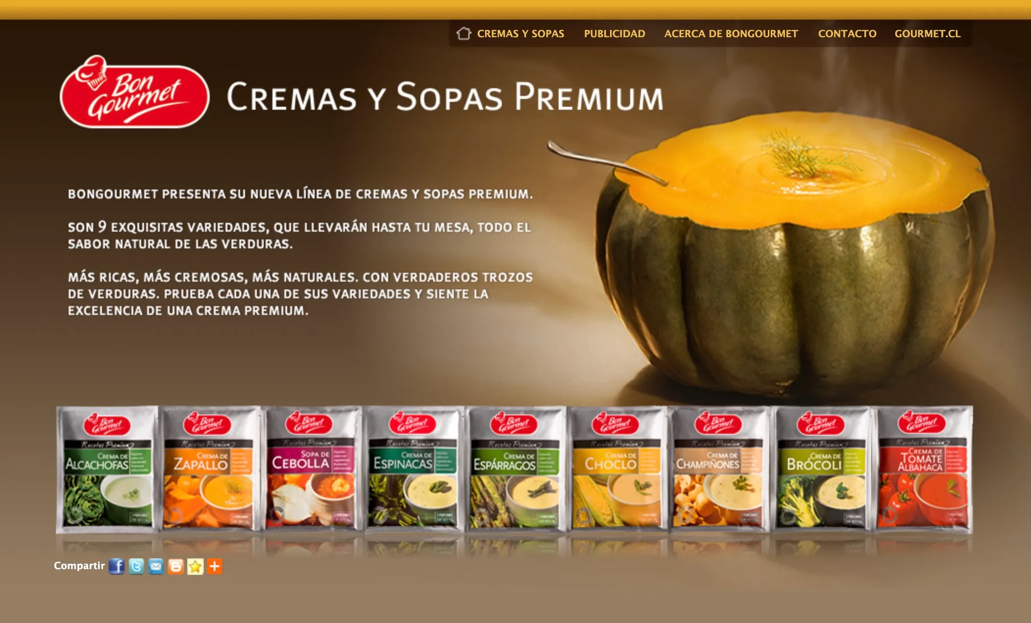
Process and Methodology Early introduction of SEO and Google Analytics metrics for organic loyalty. User research to understand their needs and behaviors. Guerrilla-style usability tests to get quick feedback and iteratively improve the designs.

Progressive creation of new products in the digital ecosystem: monthly mailing, gamification, online store, integrated social media (Facebook, YouTube, and Twitter), and digital launch campaigns for new products.

Migration of the site to WordPress in the latest versions, making sure the acquired SEO capital was not only maintained but improved. Development of a custom "Gourmet theme" as a design system to make creating and editing pages easier through templates. Training the client so they could independently manage adding content, such as recipes, cooking tips, and more.

Results and Impact User-centered information architecture and efficient flows. From 150 to 40,000 organic subscribers to the monthly mailing, with organic sign-ups from active users, and a high read rate and very low bounce rate.

Excellent organic SEO positioning and sustained growth of the brand in the digital ecosystem. A client empowered to manage digital content without depending on the technical team.

  • Design Thinking
  • Information Architecture
  • HTML/CSS
  • WordPress
  • SEO
  • Design System
  • Typography
  • Color

Other Projects Over the course of my career, I have had the opportunity to work with many brands and companies, large and small, across a wide range of sectors, designing their digital products. Each project has been a unique opportunity to learn, apply methodologies, and design solutions for very different types of users and needs. Some examples:

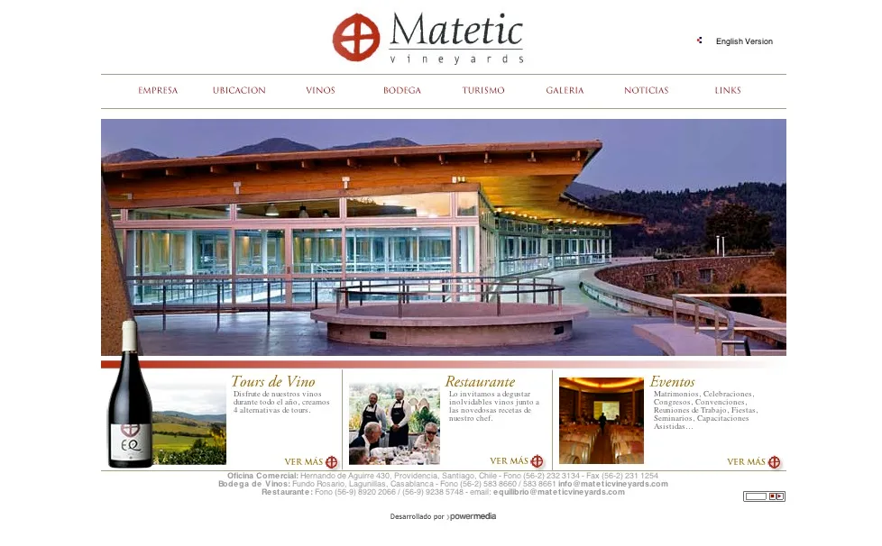
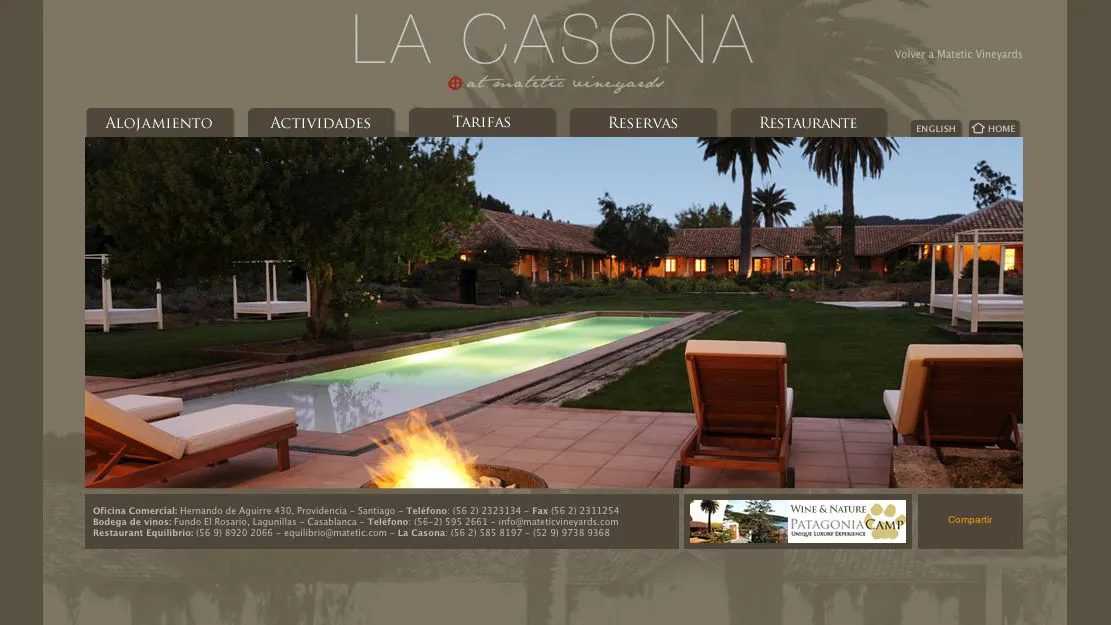
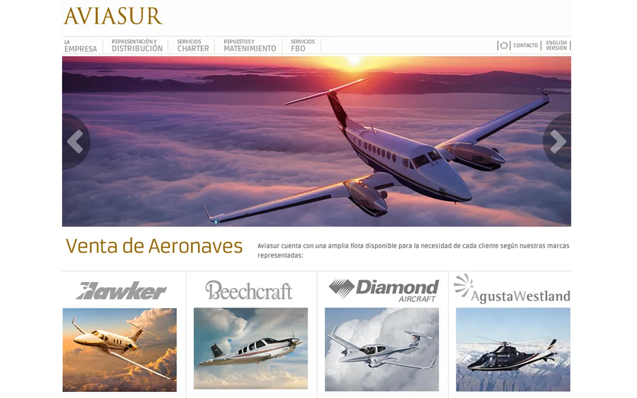
Matetic, La Casona, and Aviasur: Design, development, and monthly updates of websites. Several versions over the years.

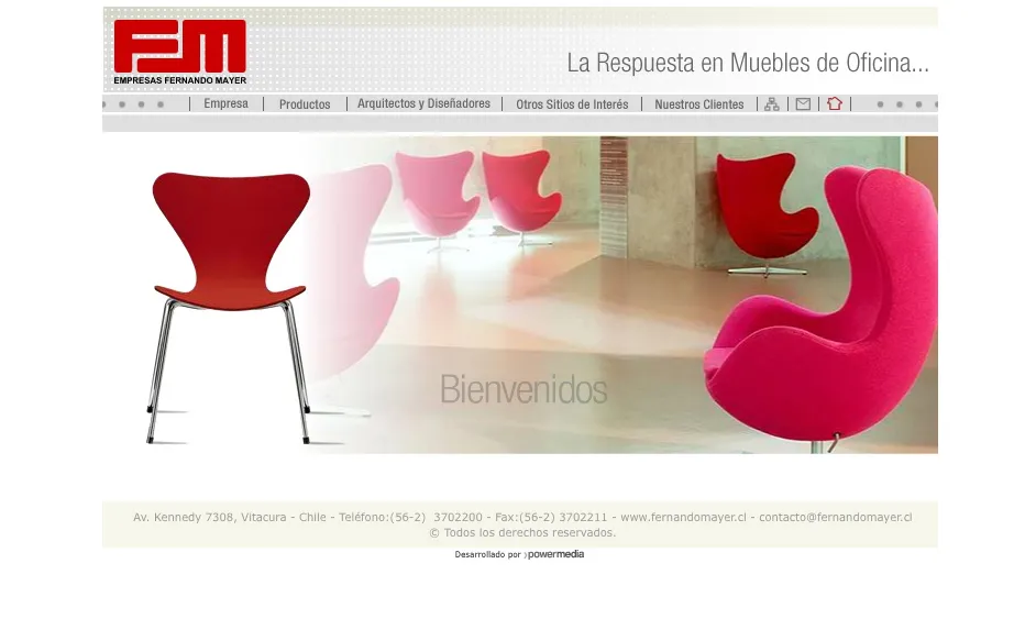
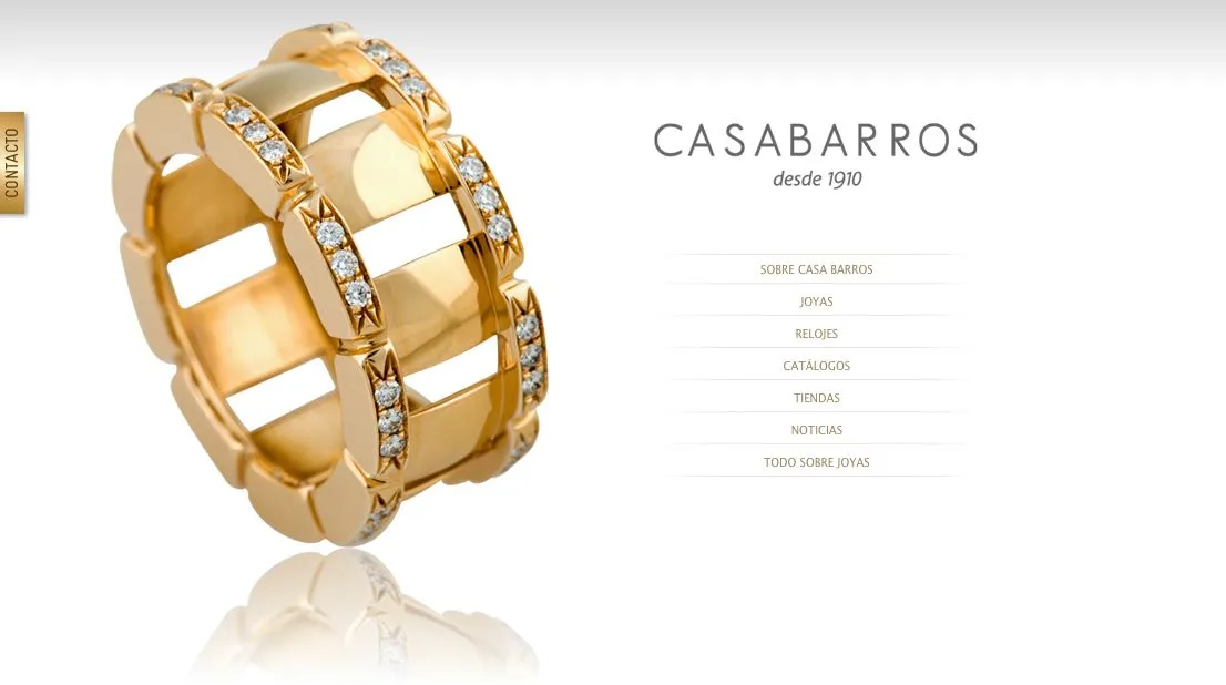
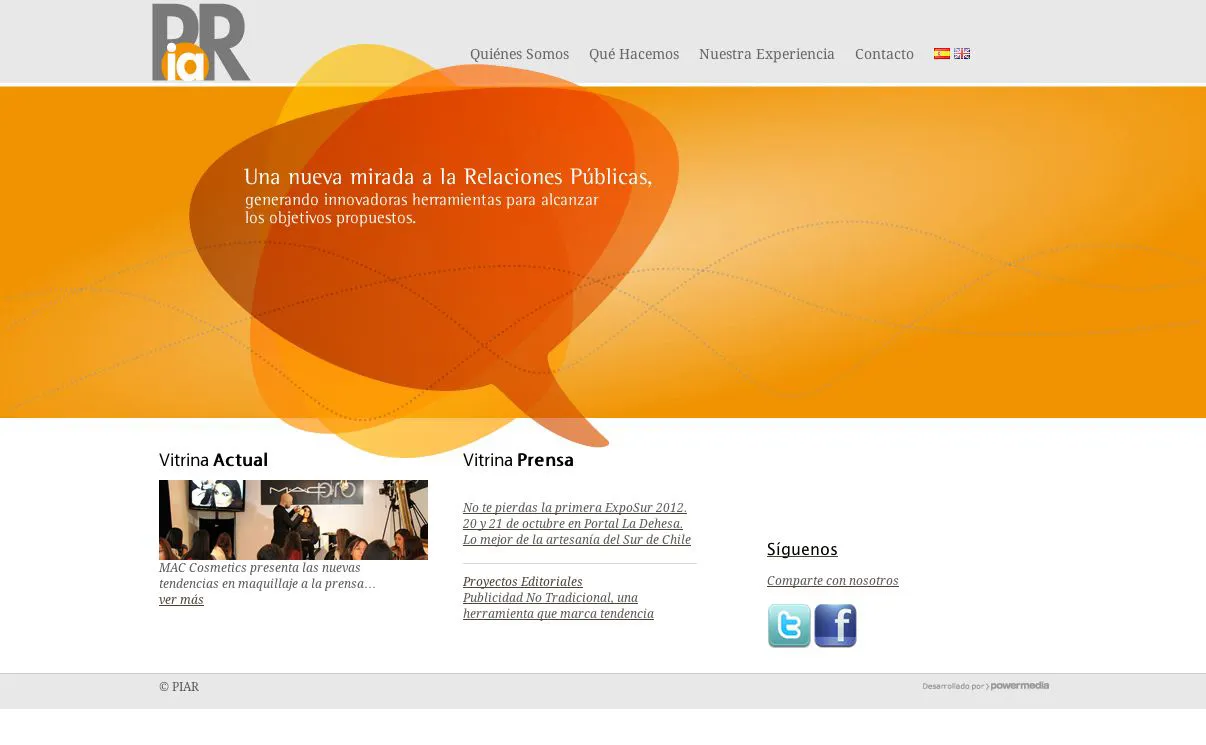
Fernando Mayer, Casabarros, La Casona, Piar: Website redesign and information architecture.

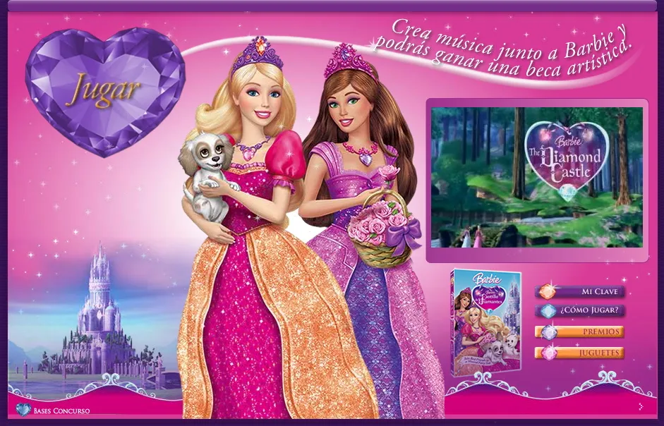
Barbie: Design of an online game for the Barbie Diamond Castle launch campaign.

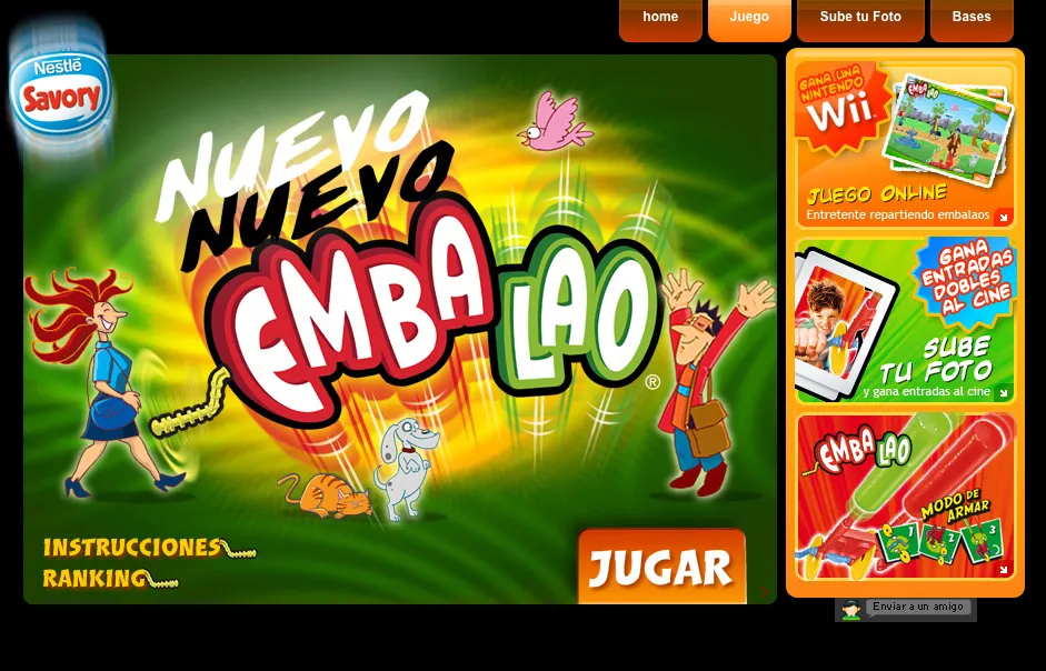
Embalao: Design of an online game for the launch of the "Embalao" ice cream from the Savory brand.

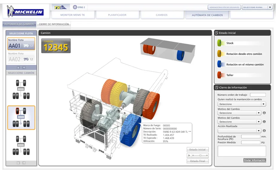
Michelin: User interface for an application. Data interpretation and status monitoring of mining tires.

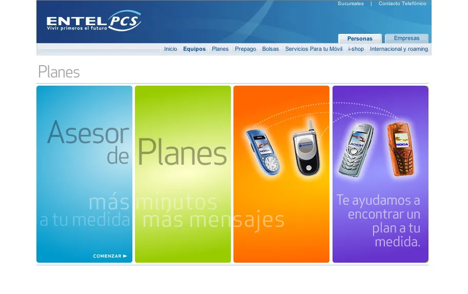
Entel PCS: Web application that recommends mobile phone plans.

  • Agile Environments
  • Visual Design
  • Design Thinking
  • Information Architecture
  • Adobe Suite
  • Color
  • Typography
  • Layout
  • High Fidelity

03 — Skills

What I bring to the team

UX Research

  • Interviews
  • Benchmarking
  • Usability Testing
  • User Persona
  • Journey Maps

UI Design

  • Wireframes
  • Hi-Fi Prototypes
  • Design Systems
  • Information Architecture
  • Motion UI

Tools

  • Figma
  • Adobe Suite
  • VS Code
  • SEO / Google Analytics
  • WordPress

Front-End

  • HTML
  • CSS
  • Bootstrap
  • WCAG Accessibility
  • Responsive Design

Strengths

01User-Centered Design

Based on qualitative and quantitative data.

02Curiosity

Continuous technology learning, new methodologies and tools.

03Adaptability

To new challenges, teams, and processes.

04Generative AI

Aimed at improving design efficiency and quality.

04 — Contact

Let's start something new.

Have a project in mind or want to talk about an opportunity? Write to me.

Enter your name.

Enter a valid email.

Write a message.

"Listen first, sketch later."

I'm available for freelance projects, collaborations, and full-time positions. My location is flexible and I work remotely with international teams.

Availability

Available for new projects